Thursday, 21st May marks Global Accessibility Awareness Day (GAAD). It’s that one day a year when the digital world collectively remembers that not everyone uses a mouse, sees 20/20 vision, or processes information in the same way.
But at Chatter, we’re not big fans of "one day a year" thinking. Because, really, accessibility should be the foundation of your employer brand.
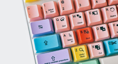
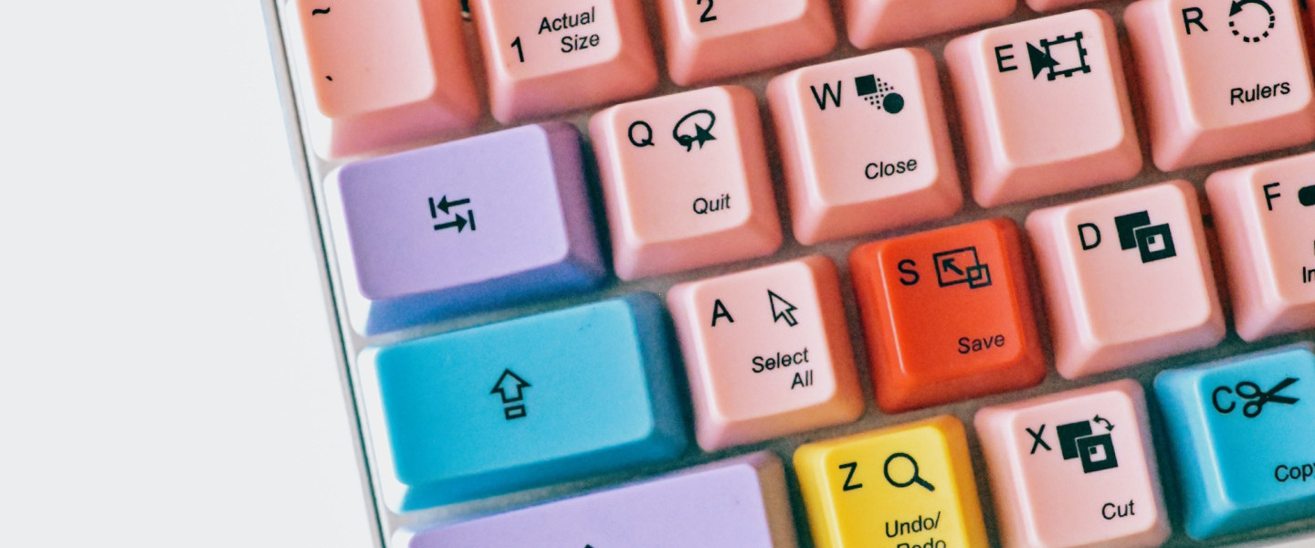
We talk a lot in this industry about "clicks to apply." We obsess over friction in the funnel. But when was the last time you asked about "tabs to apply"? For a significant portion of your potential workforce, the "click" doesn't exist. If your careers site requires a surgical level of mouse precision just to find a job description, you aren't just making it difficult, you’re effectively putting a ‘No Entry’ sign on your digital front door.
The Scale of the Silence
Let’s start with a reality check. How many people in the UK do you think have accessibility needs?
If you guessed a small minority, the data might surprise you. As of May 2025, approximately 6.9 million people in Great Britain - about 10.8% of the population - are entitled to disability benefits. When you widen the lens to include neurodiversity (like dyslexia or ADHD) and temporary impairments (a broken arm, or even just a heavy glare on a mobile screen), the number of people who struggle with ‘standard’ web design is staggering.
The Plugin Fallacy
We see it all the time. A company realizes their site isn't accessible, panics, and sticks a toolbar or an accessibility plugin on the side. Problem solved, right?
Wrong.
Actually, worse than wrong - it’s often counter-productive. These overlays are the digital equivalent of putting a ramp at the back of a building next to the bins. They’re a bolt-on that often interferes with the screen readers and assistive technologies that people actually use.
Accessibility isn’t something you sprinkle on at the end like salt; it has to be baked into the recipe. It’s about semantic structure, thoughtful UX, and proper coding. If you have to click a special button to make a site usable, the site wasn't designed for the user in the first place.
The Myth of the Ugly Site
There is a persistent, nagging myth in creative circles that accessible means boring. People imagine a world of black-and-white text and no images.
Let’s kill that myth right now. You don't have to compromise on world-class design to be accessible. Some of the most beautiful sites we’ve built - for brands like Asda, KFC UK&I, and ITV - are highly compliant.
Take the KFC careers site. It’s vibrant, brand-led, and high-energy. But under the hood, it’s a masterclass in accessibility. The colour contrasts are sharp enough for everyone to read, the navigation is logical, and the "focus states" (that little box that shows where you are when tabbing) are clear.
Good design is inclusive design.
The AI Trap: Vibe Coding vs. Inclusive Coding
We’re in the era of AI-generated everything. You might think, "Can't I just use AI to build an accessible site?"
Here’s the issue: AI builds from the general internet. And, frankly, the general internet is a mess. Most websites are not accessible. So when AI vibe codes a solution for you, it’s likely replicating the same bad habits that have excluded people for decades. AI doesn't understand the experience of a screen reader; it just understands patterns.
To get it right, you need humans who actually care about the outcome.
SEO, GEO, and the Moral High Ground
Even if you aren't moved by the moral argument (which, come on, you should be), let’s talk business.
Search engines (SEO) and the new wave of Generative Engine Optimization (GEO) view your site much like a screen reader does. They read the code. If your site has no alt-text for images, messy heading structures, and buttons that aren't labeled, Google won't just think your site is inaccessible - it will think it’s low quality.
An accessible site is a searchable site. By building for a candidate with a visual impairment, you are simultaneously building a site that search engines love to rank. It’s the ultimate win-win.
What Does "Bad" Actually Look Like?
We’ve all seen it.
- The "Click Here" Trap: A page full of links that all say "Click Here." For a screen reader user, that's just a list of "Click Here, Click Here, Click Here." They have no idea where they’re going.
- Color Blindness Disasters: Using green for "pass" and red for "fail" without any text or icons. For the 1 in 12 men with color blindness, that’s a guessing game.
- The Keyboard Cul-de-sac: You tab into a video player or a map, and you can’t tab back out. You’re trapped.
The Chatter Best Practice Checklist
When we audit a careers site, we look at the five key points:
- Semantic Marking: Is a heading actually tagged as a Heading 1? Or is it just a paragraph that you made "big and bold"? Screen readers use headings to jump through content. If you don't mark them correctly, the user is lost.
- Keyboard Navigation: Put your mouse in a drawer. Now, try to find a job and apply using only the Tab and Enter keys. If you can’t do it, your site is broken.
- Visual Focus: When you tab through a site, do you see a clear highlight around the element you’re on? If not, keyboard users are flying blind.
- Alt-Text: If your site has a hero image of "people laughing in an office," does the code tell the user that? Or does it just say IMG_5432.jpg?
- Text Over Images: Ensure there is enough contrast. White text on a busy, light-coloured photo is a nightmare for everyone, not just those with visual impairments.
So, what now?
Accessibility can feel like a mountain, but you don’t have to climb it alone. We’ve done this before, and we believe that the best talent shouldn't be barred by a poorly coded button.
Our GAAD Challenge to you: Go to your careers site right now. Hit the 'Tab' key. How many times do you have to hit it before you get to the "Search Jobs" button? Because we need to start thinking about not just clicks to apply, but tabs to apply.
Want to know where you really stand? We’re offering a limited number of Accessibility Audits to help you understand where your barriers are. No plugins, no quick fixes - just a proper look at how to make your brand accessible to everyone.